
The Flexibility team at CREDS have created a video which explores how energy demand is made, and the challenges of demand side interventions.
The Flexibility theme has been working on a series of exhibits to share the insights from their research into energy flexibility. The resulting gallery, which is still in development, can be found on the Flexibility gallery website
The timing of energy demand: Daily, weekly and annual patterns of activities and how they connect video is their newest exhibit.
Video transcript
The timing of energy demand: Daily, weekly, and annual patterns of activities, and how they connect.
In the Flexibility theme, one part of the Centre for Research into Energy Demand Solutions, we have been thinking about how the timing of energy use connects with the timing of energy demand. Dynamic pricing, energy tariffs and carbon alerts are all designed to shift peaks in demand by encouraging people to change the times when they use energy. Interventions like these, increase the importance of understanding how the timing of energy demand is made. Understanding which energy loads might be modified and when, requires getting to grips with how daily, weekly, and annual patterns of energy-demanding activity connect.
The Centre for Time-Use Research based at Oxford University collected data about what 10,000 people in the UK were doing at different times of day between 2014 and 2015. From that data we have produced these radial graphs which show the timings of specific activities – what people are doing and when, during the day, the week, and the year. This radial graph shows when people are eating on an average weekday. It is easy to identify clear mealtimes – breakfast, lunch, and dinner.
The height refers to the amount of people carrying out an activity whilst the colour refers to its density. Lighter colours show times in which the peak of activity is less spread out, whilst darker ones show where the peak is more dispersed. We use these radial graphs to illustrate the profiles of different kinds of activities and to show how the timing of electricity demand is made. These diagrams look like flowers with coloured petals that show when different activities occur. When seen together, the flower diagrams and their petals show how activities, are sequenced and organised, and how routines play out across the year.
Some activities happen at the same time everyday. A great example of this is indeed mealtimes. As radial graphs for the whole year show, mealtimes are very stable. Patterns of sleeping are also very consistent. As this annual sequence shows, most people go to bed between 10 and 11pm and get up between 6 and 8am. Working also follows a pattern that does not change much over the year. During the week, people mostly start work at 9am, and finish around 5pm.
From these figures, sleeping, working, and eating appear to be ’anchored’, or in other words ‘fixed’, to particular times of the day. While there are some people who sleep, eat and work at different times, when you look at the majority, there is a clear structure to the working week. Although this is the general pattern, the weekend is a bit different. On a Friday and Saturday, most people go to bed later than 11 – later than they do during the working week. They also, mostly, wake up after 7am on a Saturday and Sunday. This isn’t because there’s anything essential about these times at the weekend. It is because fewer people are going to work. The absence of paid work softens the weekend schedule.
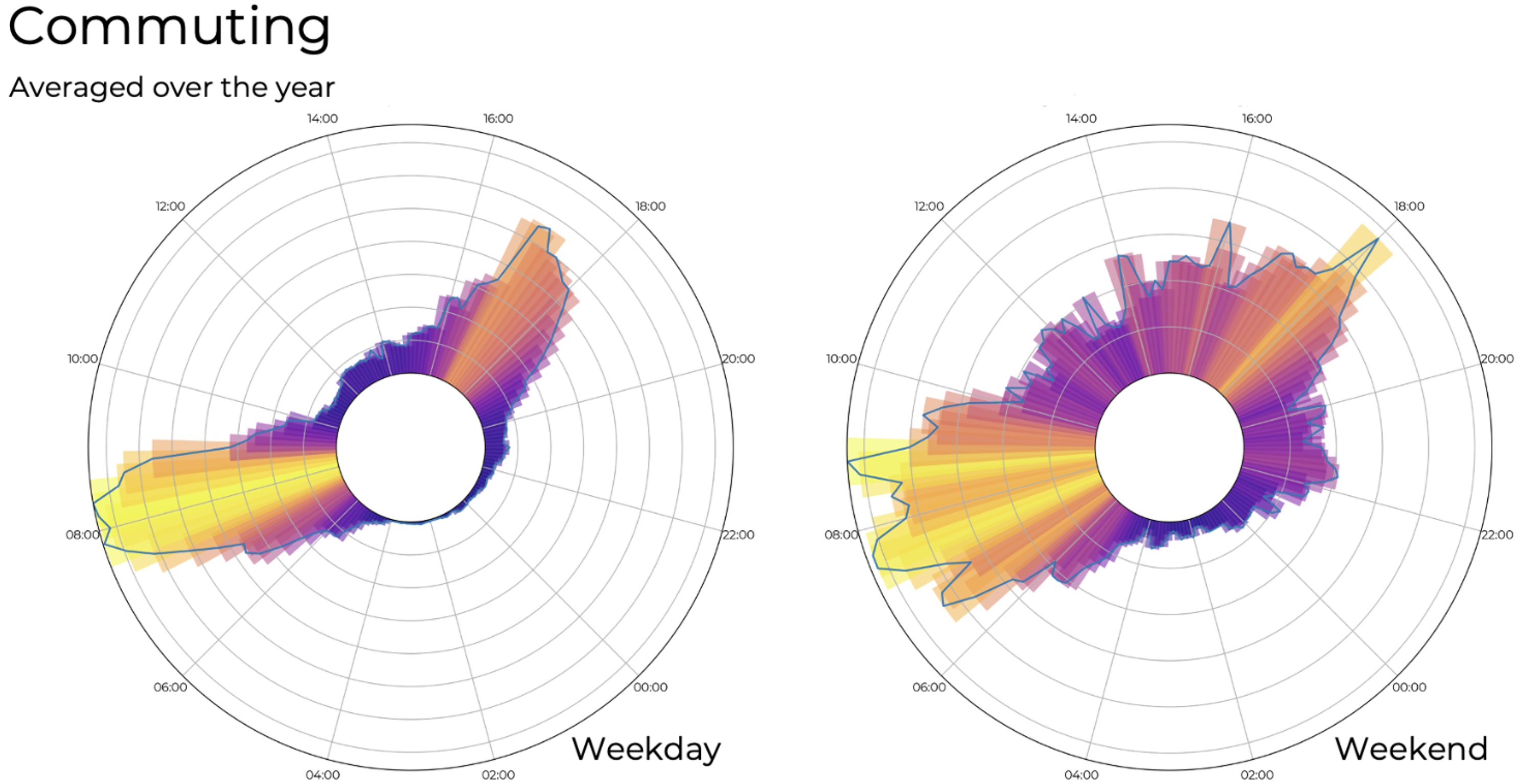
There are other ways in which weekends and weekdays are different. The timing of commuting is another example. During the week, commuting is tied to work hours and there are two clear peaks – one during the morning and one in the evening. But work looks different during the weekend, in both the hours when it is done, and the length of time spent working. Because of this, commuting is done right through the day.
The timing of one activity matters for another. Sequences are important. For example, sleep appears to be strongly connected to work during the week, and so is commuting, though not at the weekend. These are not the only connections involved and as the figures suggest, sequences of sleeping, commuting and work depend on longer chains of activity.
The timing of what is called ‘personal care’ (showering, bathing, getting dressed) illustrates what we might think of as extended sequences. Even though personal care could happen at different times of the day, it follows a distinctive pattern – fixed in a sequence between sleeping and working. Because work and sleep are fixed anchor points in time – other activities are organized around them. After waking up, people get ready for work – they do ‘personal care’, and they have breakfast, before commuting, and embarking on the working day. When they finish work, and commute home, they ‘fit in’ more personal care alongside eating and watching television, before going back to sleep.
There are many sequences like this in daily life. For example, doing the laundry depends on sorting clothes, and on washing, drying, and putting them away. These activities are always done in this order. These many sequences of daily life are intertwined across the day. The bunching together of sequences leads to instances of synchronisation – this is when many people are doing the same thing at the same time.
This figure illustrates a classic example of synchronisation: even today many people sit down to watch prime time television at around 9pm in the evening. It is true that people now watch more on demand TV, when compared to 2015, but the activity of television watching retains its place in evening routines, precisely because of the timing of activities that come before and after it.
Moments of synchronisation aren’t always fixed. Some vary across the year, as the activities that hold them in place also change. The school run is a good example. During term time, children are dropped off at school at 9am and picked up again around 3pm. But care-related travel routines change during the school holidays. This is especially obvious when looking at August when schools are shut. Annual variation in the timing of the school day is one example of what we can call an institutional rhythm. The institutional timing of the school day shapes the timing of activities that are sequenced and connected to it, including: travel, work, eating, and so on. As this example suggests, it doesn’t make sense to think about the timing of different activities one by one. Instead, when we put some of the ‘flowers’ together, and when we consider their connections, we begin to see a total ‘garden’ of practices.
As in real gardens, the flowers change through the year. It is this mass of interconnection that matters for what people do, and for when and where energy is used. The flowers represent a snapshot of data taken from 2014 and 2015. But the patterns they make evolve along with the histories of activities, connections, sequences, bundles, and institutional rhythms that make up the timing of daily life.
Interventions that encourage individuals to shift the timing of their energy consumption miss the point that the timing of demand is embedded in the timing of everyday life. Shifting peaks and troughs in energy demand depends on the making and breaking of sequences and on patterns of de- and re-synchronisation. These longer-term processes depend on the collective rhythms that make up the garden of practice.
It explores how demand side interventions like dynamic pricing, energy tariffs and carbon alerts might be misguided in missing out on the relationship between the timing of energy use and the timing of daily activities. This is because energy is not used for its own sake, but in the accomplishment of everyday activities like eating, working, and television watching.
Making use of radial graphs that show when 10,000 people were carrying out activities in 2014 to 2015, the video examines the relationships between activities that are more or less fixed in time, and others that may – at first glance – appear to be more ‘flexible’.
Because of these kinds of relationships, it doesn’t make sense to think about the timing of different activities one by one. Instead, when we put them together, we start to see something of the mass interconnections that make up a social rhythm. Interventions that encourage individuals to shift the timing of their energy consumption miss the point that the timing of demand is embedded in the timing of everyday life.
Banner photo credit: Taken from Flexibility video